Reduced Gravity Experiment
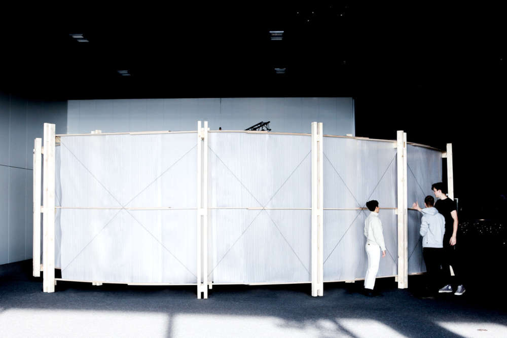
The reduced gravity experiment investigates how people will move on other planets and how that influences the design of architectural elements (e.g. stairs and doorways). The mechanism allowed participants to experience walking around weighing ≈ 38% of their normal weight. It is part of an ongoing research project aimed at defining the design standards in space. This pavilion was built for a science conference in Bulgaria.
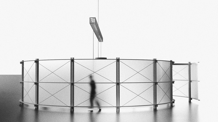
Visualization of the Reduced Gravity Pavilion.
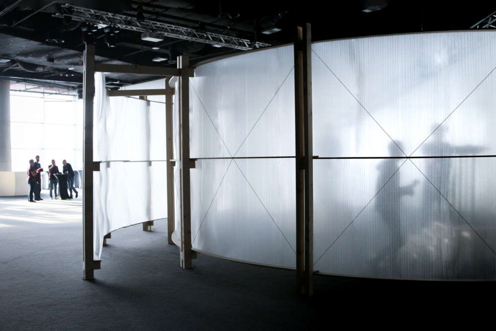
We wanted to catch people's attention through the walls, so visitors would get intrigued from the outside, but would need to walk in to see what was happening.
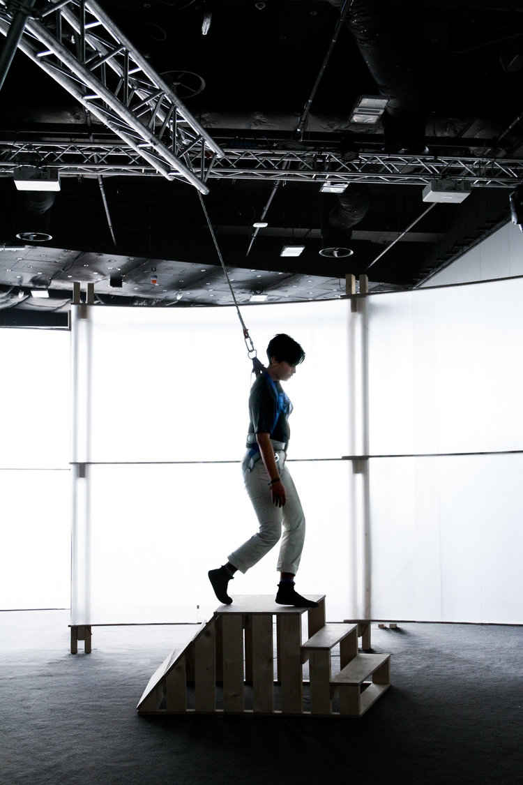
Here a participant walks down a staircase only weighing 38% of her normal weight. This is one of three staircases each testing a different angle.
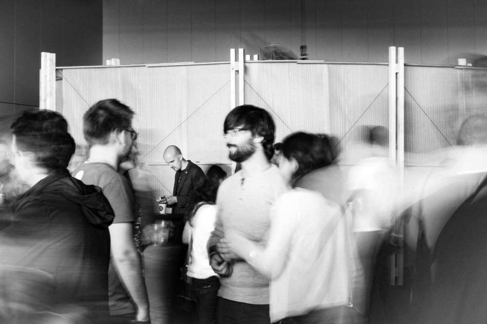
The pavilion was very popular on social media #instagramable
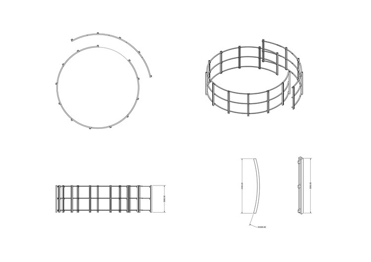
Orthographic projection of the pavilion structure.
All the parts were prepared in Bulgaria, and easily assembled at the site, with minimal amounts of tools and waste. The pavilion was designed as elements which were CNC-cut in advance and quick to assemble.
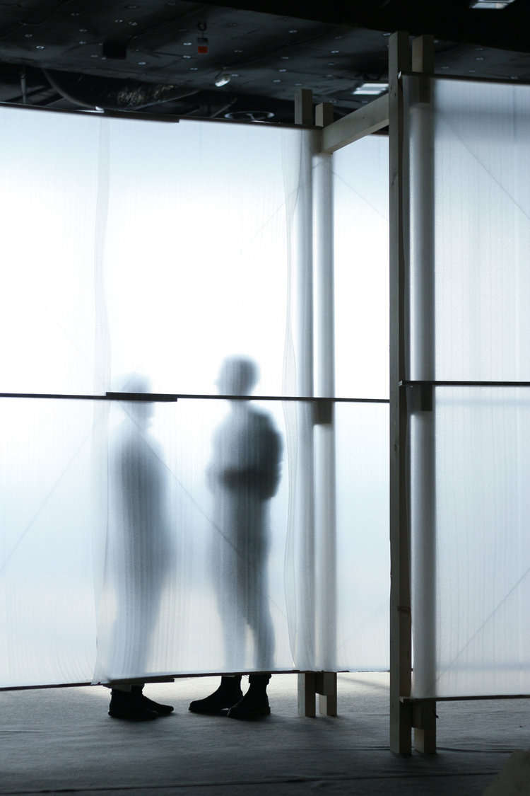
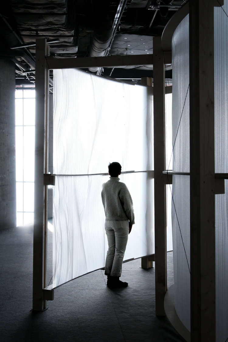
We wanted to create an even background for the experiment inside while allowing the audience outside to sense the moving silhuettes. Incidentally, we discovered that packing foam was the perfect material for the skin since It's available everywhere and fits the tight budget, and would still providing a beautiful diffused light inside.
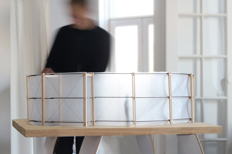
Physical models are crucial to our creative process. Here is a working model in 1:10. We use it to understand materiality and proportions (human silhouette for scale). The final pavilion ended up looking very similar to this in all aspects. Even the degree of transparency was accurate.
Using physical models minimizes the risks of unforeseen challenges. It also provides a more intuitive workflow.
